BACK
Designing adaptable, scalable UX patterns across project management and ecommerce
ROLE
UX Design Intern
TIMELINE
May - Aug 2025
PRODUCT SPACE
Enterprise B2B SaaS
TOOLS
Figma, v0, Jira
[CONTEXT]
Working across teams, domains, and product constraints.
As a UX Design Intern at Trimble, I worked across two distinct product domains — ProjectSight (construction project management) and Trimble’s global ecommerce platform.
Across three projects, I designed scalable components that clarified complex data, reduced cognitive load, and aligned multiple teams during a web-framework migration.

[PROBLEM]
Legacy components weren’t built for the scale, complexity, or content structure of modern workflows.
Each product area had critical UX gaps rooted in the same issue.
This showed up differently across teams, but despite different surfaces, the underlying design challenge was the same:
The components were not adaptable to evolving data models, user needs, or business constraints.
[PROJECTSIGHT]
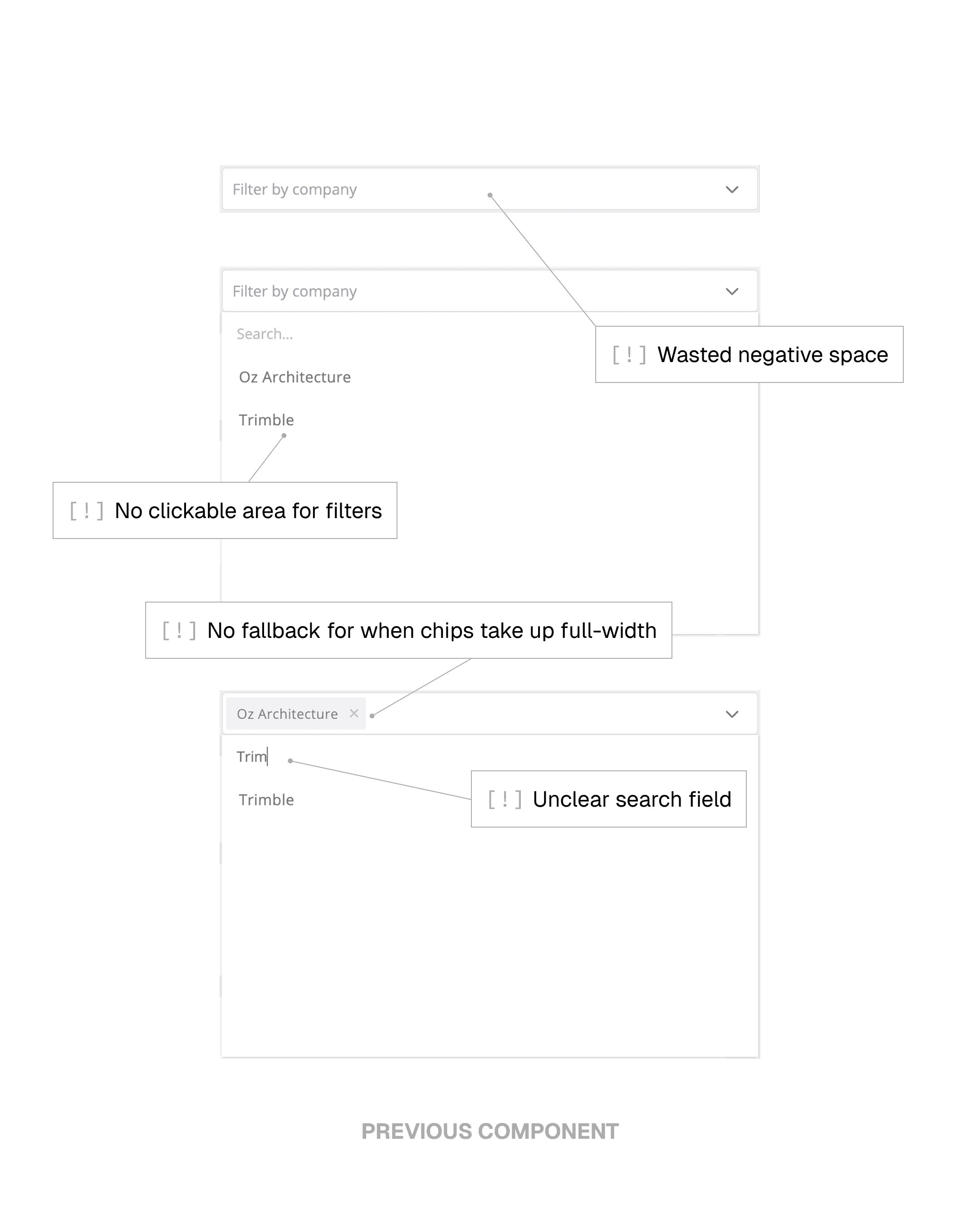
Users couldn’t filter massive daily-report datasets by multiple categories (e.g., company + location).
[ECOMMERCE]
Pricing cards didn’t support global requirements or drive conversion.
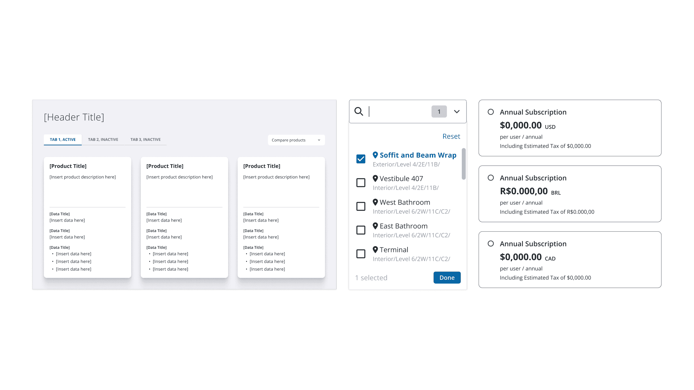
[PRODUCT COMPARISON]
Subscription-style tables broke when applied to long technical specs and multi-industry content.
[PROJECTSIGHT]
Rebuilding a component-based workflow for scale and function.
ProjectSight is Trimble's flagship project management tool, used by thousands of construction job sites around the globe.
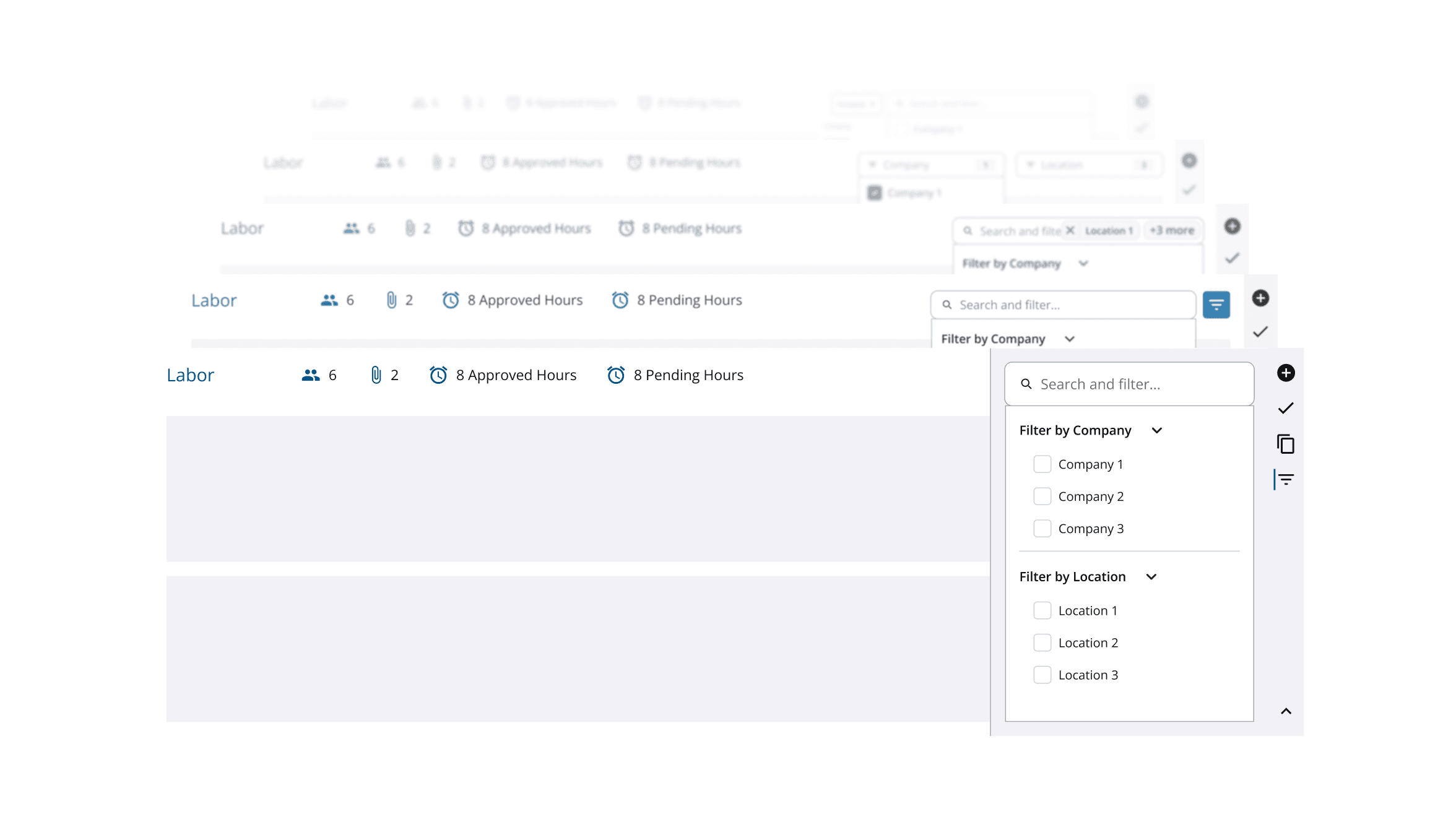
Field teams needed to filter 50–100+ job site locations for daily reporting, but the existing dropdown couldn’t support multi-category filtering or large data sets.
Exploring interaction patterns for data filtering in the context of construction project management.
I explored several interaction models for filtering — from simple dropdowns to multi-category panels — with the goal of reducing cognitive load while giving field teams more powerful ways to refine their data.
Early iterations tried to let users filter within each data-type panel (like Labor or Equipment), but constant feedback with PMs showed this was over-engineering the workflow. Users needed more control, but not that much granularity; I was solving a deeper problem than the one actually blocking their efficiency.
[Early iterations of filtering within data panels – scrapped but reused component patterns for future iterations.]
Preserving UX while navigating engineering constraints.
My initial concept reordered active filters in real time to keep selected items visible — but engineers couldn’t support dynamic list movement without performance issues. Instead of removing the behavior entirely, I redesigned the interaction so reordering happened after users applied changes. This maintained clarity and predictability while staying fully buildable within engineering constraints.

[To abide by technical constraints from engineering, I created an updated interaction for sorting active filters that preserved UX.]
Designing a compact component for a multi-category future.
The new filtering UI needed to sit alongside other categories without overwhelming the layout or introducing visual clutter. I created a narrower, modular component that aligned with Trimble’s evolving design system and could scale to additional data types during the framework migration. This turned a one-off solution into a reusable building block other teams could adopt.
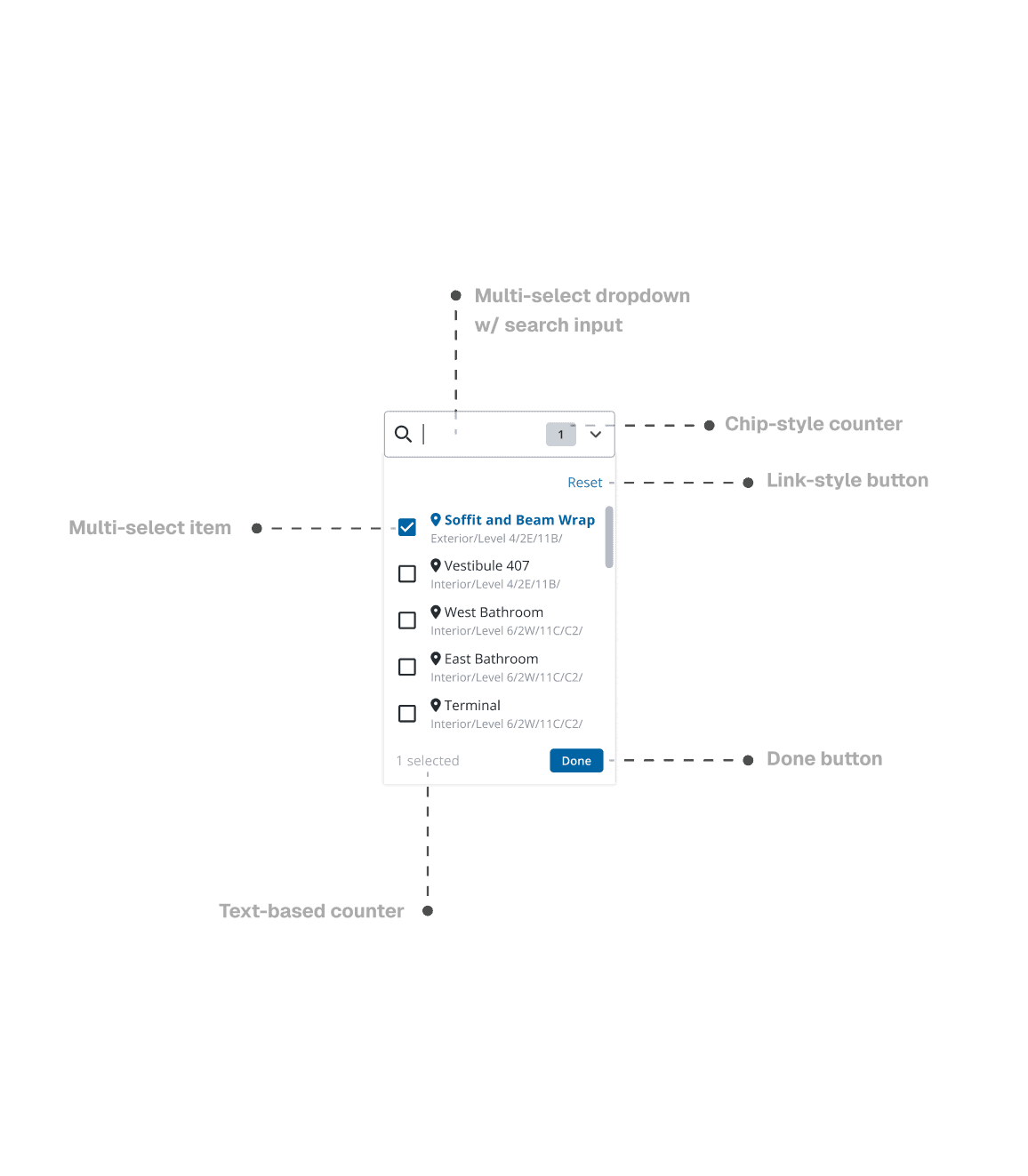
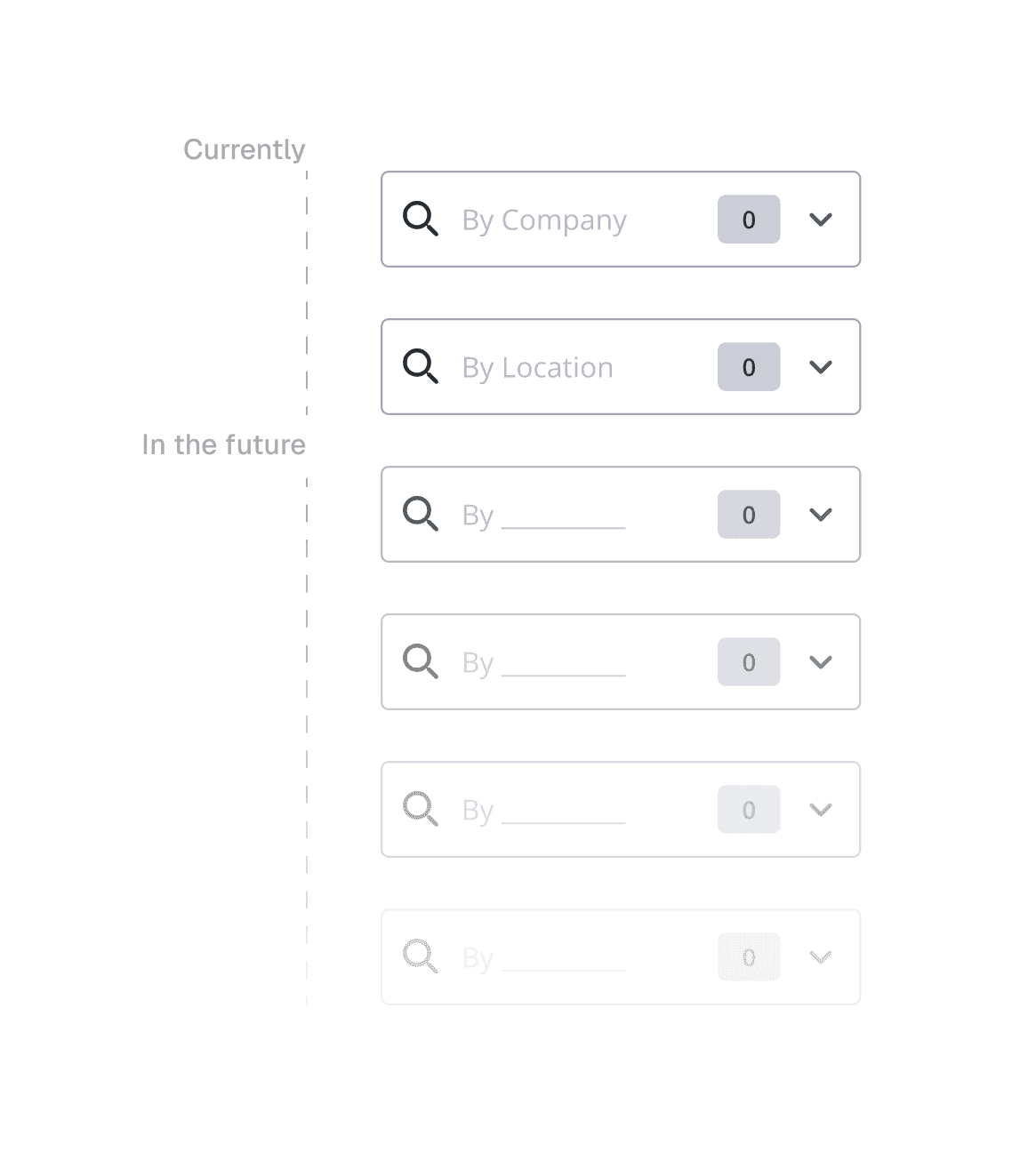
[I created a small, modular component responsible for one category of filtering, allowing for multi-category filtering via multiple components when used in conjunction on the same page.]
[ECOMMERCE]
Creating pricing cards that drive product clarity and conversion.
Trimble E-commerce serves global customers, driving sales and user acquisition for its growing product line.
New pricing cards needed to support global tax laws, localization, discount logic, and responsiveness — while staying consistent with both the Global DS and Marketing Experience styling.
Rebuilding pricing hierarchy to communicate value clearly.
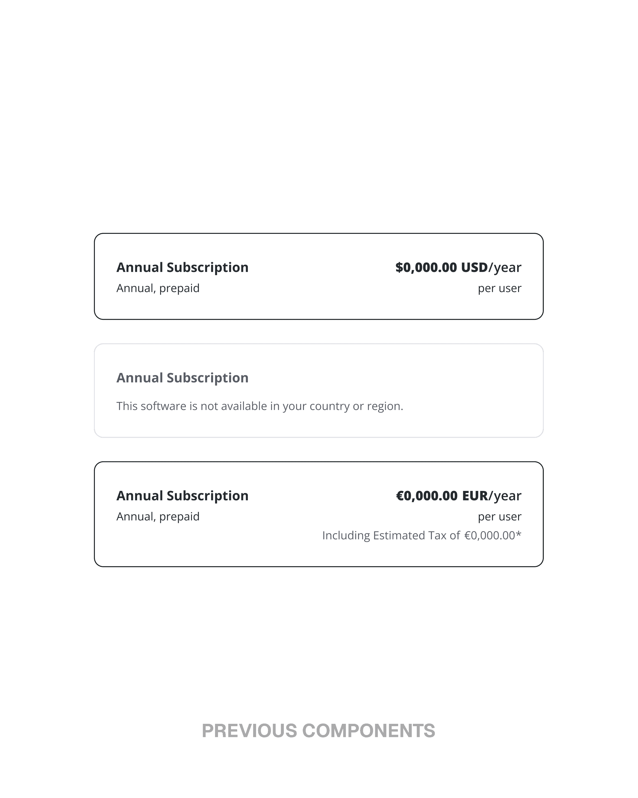
I reorganized the pricing cards to surface the elements users scan first: deal indicators, product name, price, and key actions. This required tightening the hierarchy so information remained scannable even as content density increased. The result was a layout that made value instantly recognizable across both web and mobile.
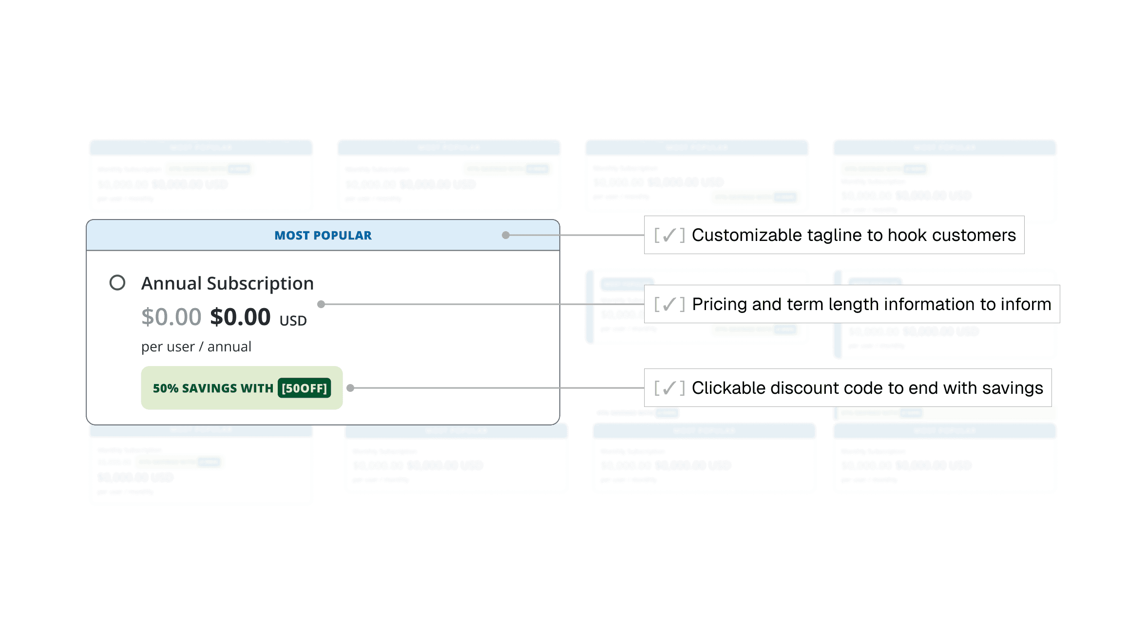
[After ~50 iterations of layout design, I landed on a hierarchy that hooked customers in, provided them with necessary info, and left them with the option to secure a deal on any product.]
Designing for global localization and legal requirements.
With upcoming support for multiple languages, tax formats, and region-specific disclaimer text, the cards needed to flex without breaking. I built patterns that accommodated long strings, variable pricing structures, and legal copy—delivering a globally ready component earlier than planned. This prevented future rollout issues and ensured consistency across international markets.

[Working with Figma tokens and variables, I created localized components across multiple languages and currencies.]
Crafting a responsive component that adapts across breakpoints.
Designing for desktop and mobile wasn’t the challenge—the transition between them was. I created a responsive system that preserved clarity and hierarchy as the layout compressed, adjusting spacing, touch targets, and visual balance to avoid overwhelming mobile users. This transformed the pricing card from a resized component into one intentionally tailored for every breakpoint.
[Testing responsiveness for pricing cards components across web and mobile sizes to ensure there were no broken layouts or errors.]
[PRODUCT COMPARISON]
Rethinking comparison for complex product decisions.
Comparison tables are critical moments in the ecommerce flow—but Trimble’s legacy subscription tables couldn’t support the depth, nuance, or industry-specific details of hardware and technical products.
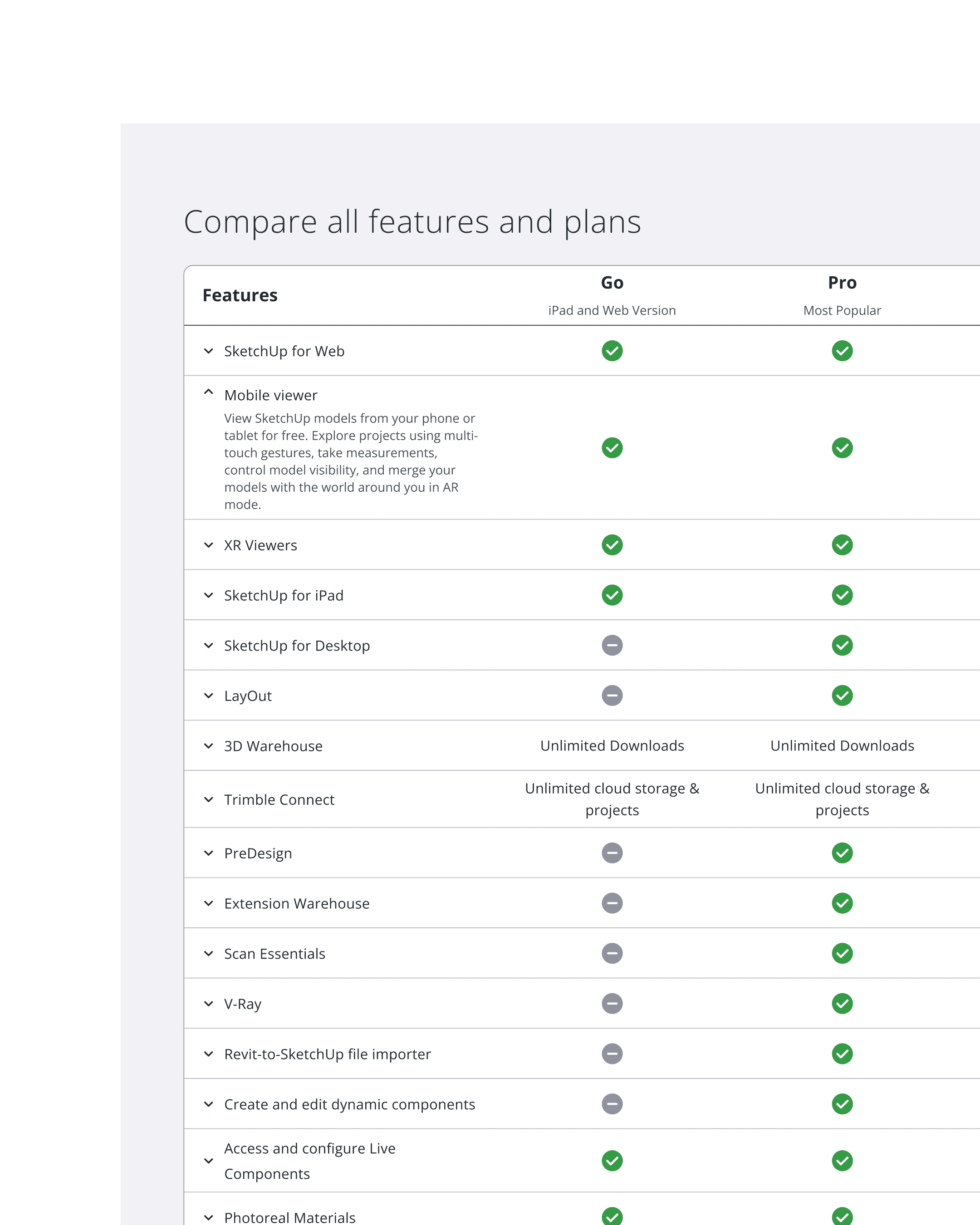
Recognizing that legacy subscription tables couldn't scale to technical content.
Subscription-style tables worked for checkmarks, not long-form specs or industry differences. As products grew more complex, the old tables broke — cluttered grids, empty cells, and 11-column scrolls. I identified this as a structural IA issue, not a visual one.
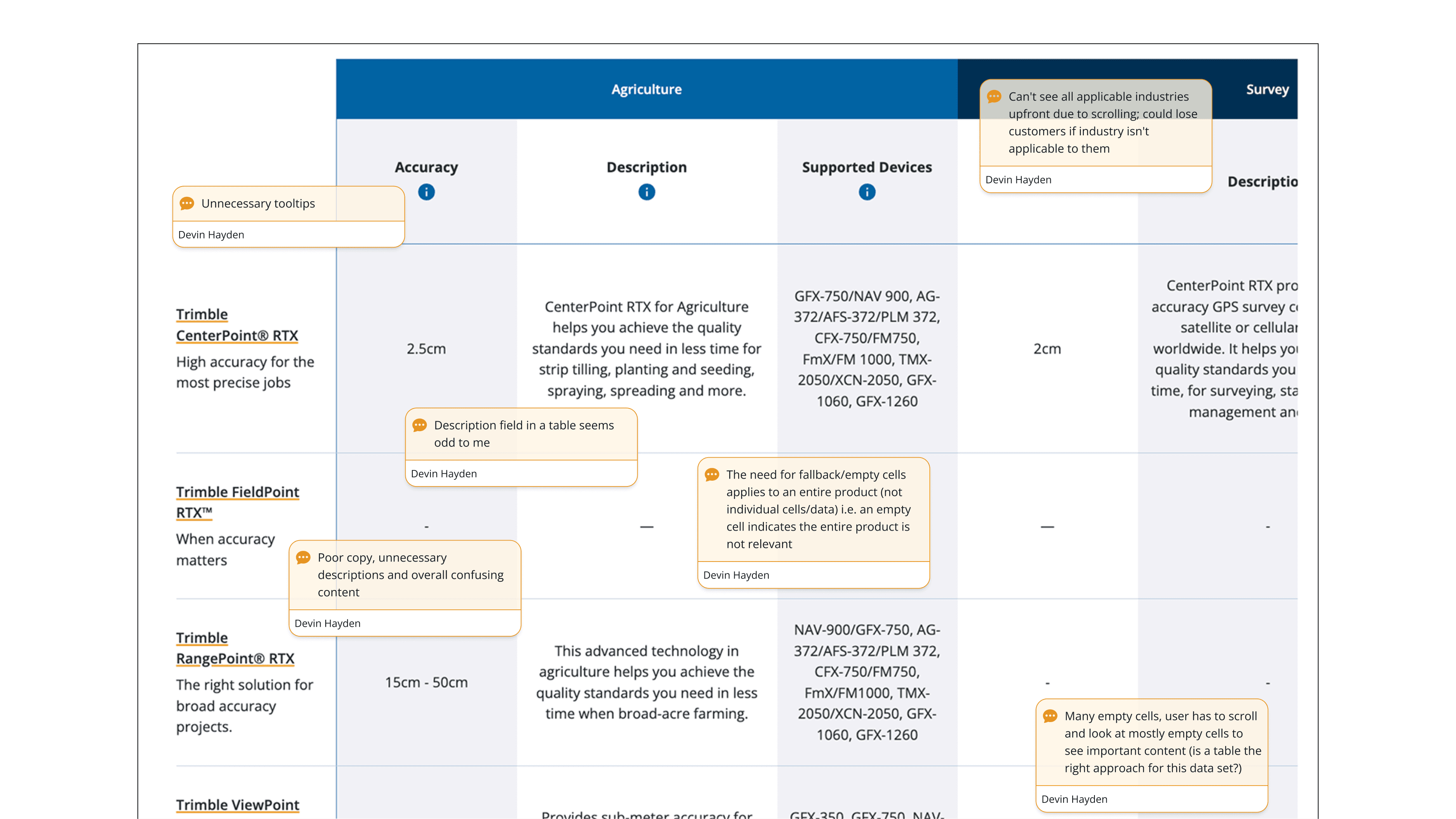
[I conducted several audits of previous table components to identify issues and pain points.]
Creating two new comparison patterns for different decision flows.
I introduced two scalable models: an updated traditional table for spec-heavy product families, and a card-based layout for cross-industry comparisons. The card layout let users filter by their industry, removing empty cells and reducing cognitive load.
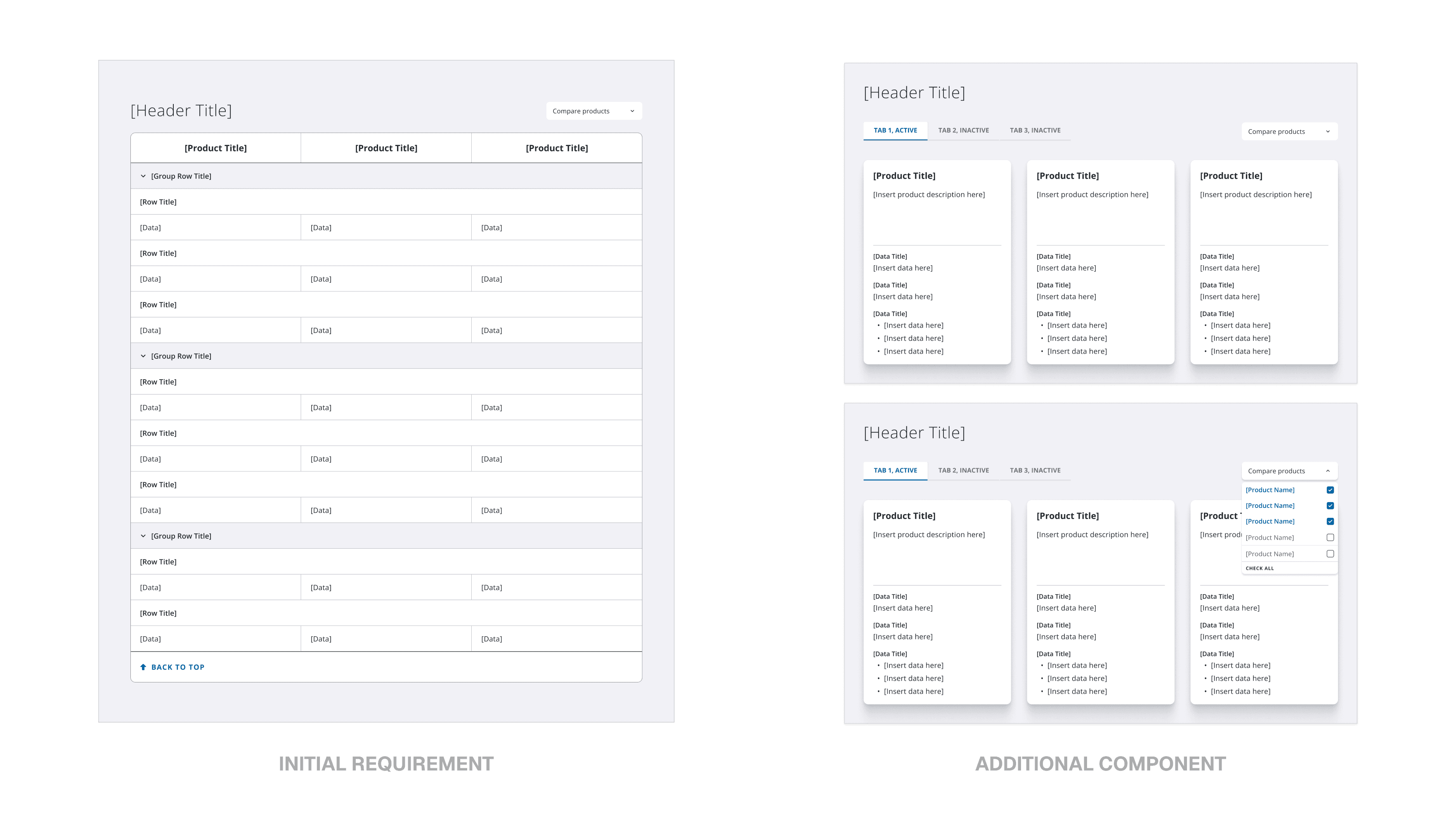
[Going beyond the initial product requirements, I pitched a new component-type that allowed for scalability and easier integration with other product types.]
Improving clarity through better information structure and responsive behavior.
I created clear content rules—like character limits, spec formatting, and interaction behaviors—to keep tables readable and consistent across products. This work went beyond visuals; it required restructuring the information architecture so technical specs, industry tags, and long descriptions fit predictable patterns. The result was a comparison system that’s easier to scan, easier to maintain, and ready to scale across future products.
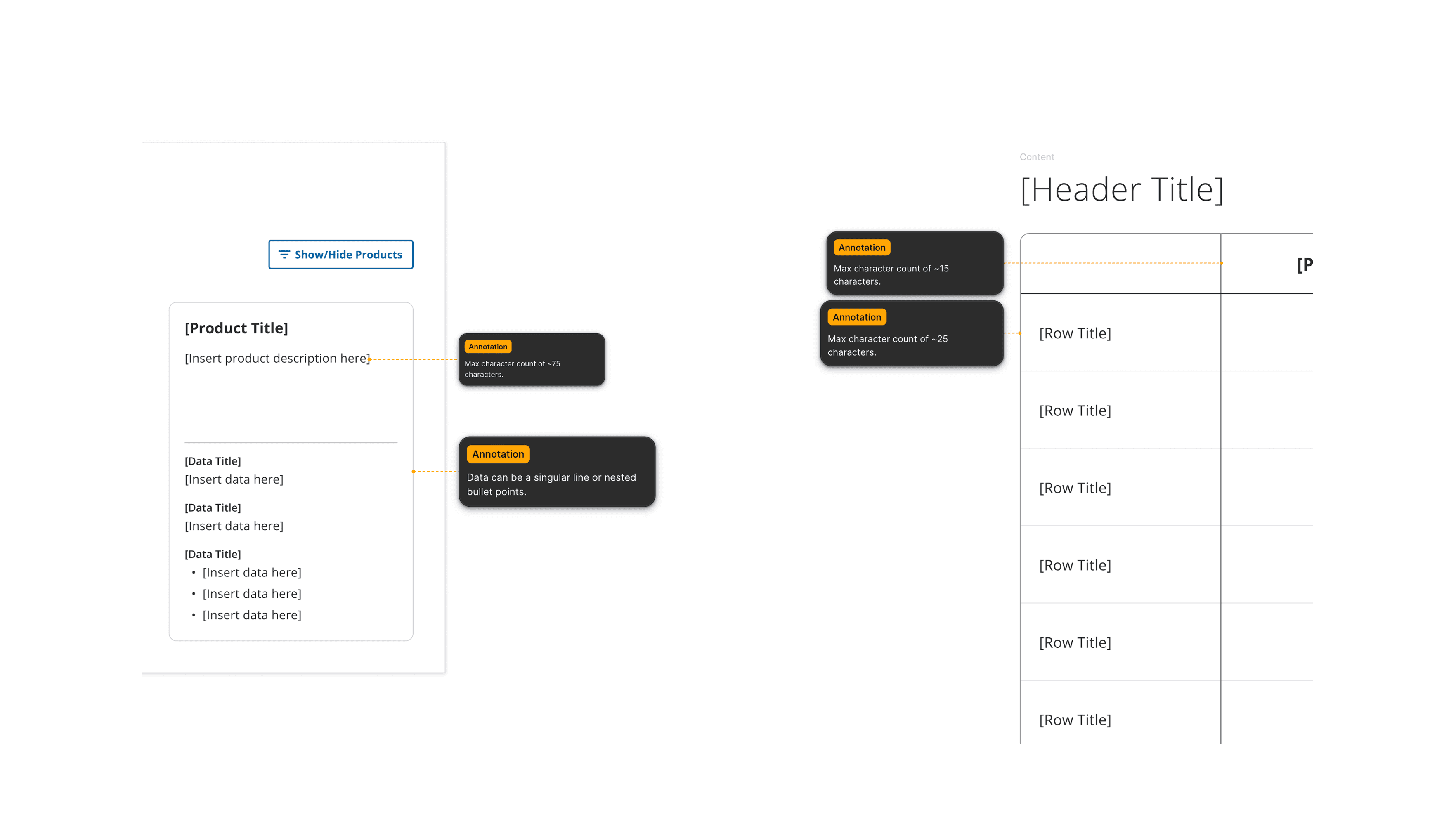
[I created annotations with content and interaction guidelines for both table components for not only developers, but for the marketing experience team to develop content for each product.]
[TAKEAWAYS]
Designing for scale in two very different product worlds.
Working across construction project management and global ecommerce taught me how to design patterns that stay clear under pressure — whether supporting 100+ data points or dense technical specs. Trimble pushed me to shape not just UI, but information architecture, content rules, and cross-team alignment.
[SMALL DECISIONS SHAPE LARGE SYSTEMS]
Designing filters, pricing, and comparison tables showed me how micro-choices — spacing, hierarchy, character limits — directly affect clarity and usability at scale. The details became just as important as the big ideas.
[STRUCTURE THE CONTENT, NOT JUST THE UI]
Many challenges weren’t visual problems but IA and content-design problems. Defining guidelines for table behavior, formatting, and copy length made the components more resilient and reusable across teams.
[ADVOCATE PAST THE REQUIREMENTS]
Several projects started as simple UI updates, but deeper investigation revealed broader UX issues. Pushing respectfully for better solutions led to new patterns that teams adopted beyond the original scope.